
💻 Python | Docker | Jenkins | Networking | Git | Linux 💻
Passionate about leveraging technology to drive efficiency and deliver innovative solutions. Proficient in Python development, Docker containerization, Jenkins automation, computer networking, Git version control, and Linux administration. Skilled in collaborating with diverse teams to deliver high-quality software products. Proficient in AWS EC2 instance management and deployment.
Seeking new opportunities to apply my expertise and contribute to impactful projects. Let's connect and explore how we can work together!
Inter-personal Skills:
Communication, Adaptability, Emotional intelligence, Active listening, Collaboration.
Happy To Connect🔗😊
Feel free to reach me out😃@ --> vrishnishreevb531@gmail.com 📬
A dashboard gives you an at-a-glance view of your data and lets you track metrics through different visualizations.
Dashboards consist of panels, each representing a part of the story you want your dashboard to tell.
Every panel consists of a query and a visualization. The query defines what data you want to display, whereas the visualization defines how the data is displayed.

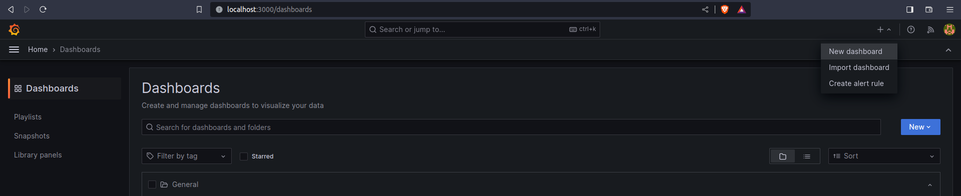
In the sidebar, hover your cursor over the Create (plus sign) icon and then click Dashboard.
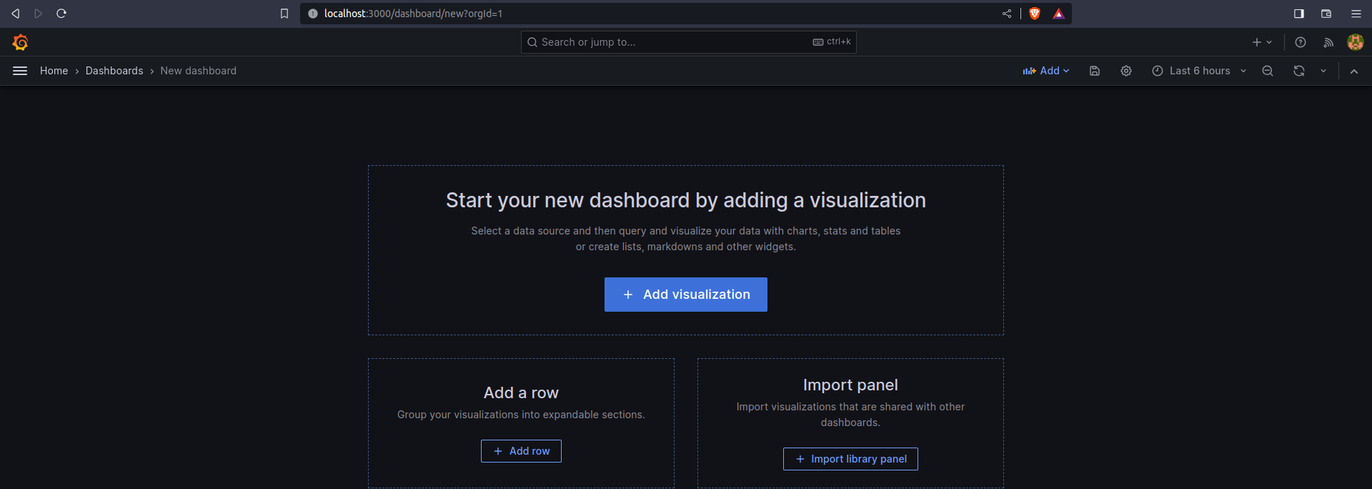
Click Add Visualization.
In the Query editor below the graph, enter the query from earlier and then press Shift + Enter:
sum(rate(tns_request_duration_seconds_count[5m])) by(route)In the Legend field, enter {{route}} to rename the time series in the legend. The graph legend updates when you click outside the field.
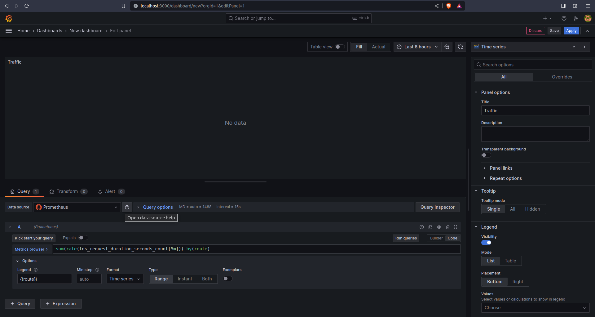
In the Panel editor on the right, under Settings, change the panel title to “Traffic”.
Click Apply in the top-right corner to save the panel and go back to the dashboard view.

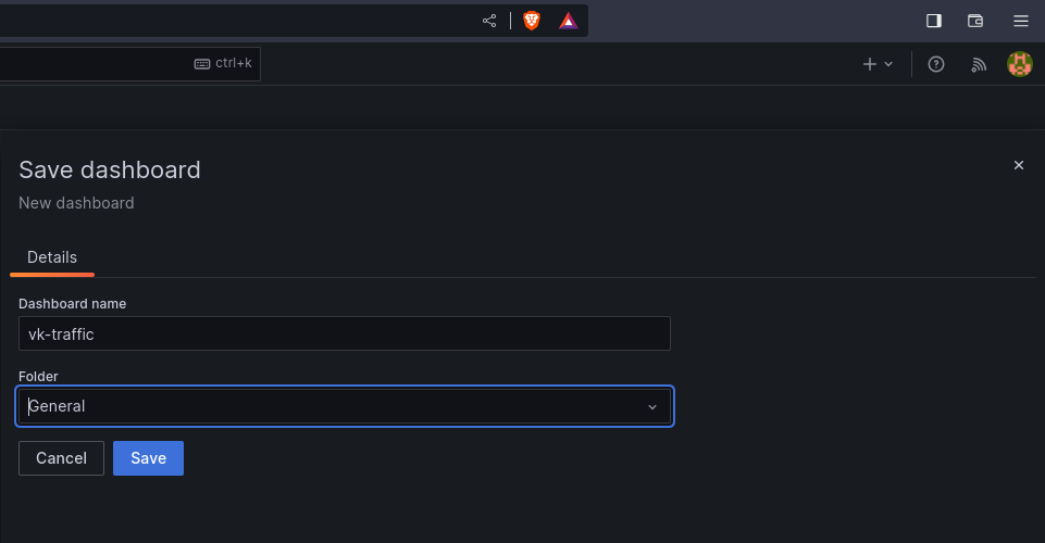
Click the Save Dashboard (disk) icon at the top of the dashboard to save your dashboard.
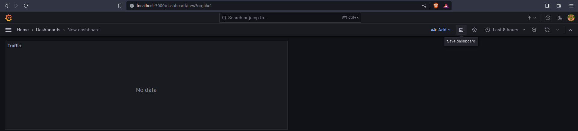
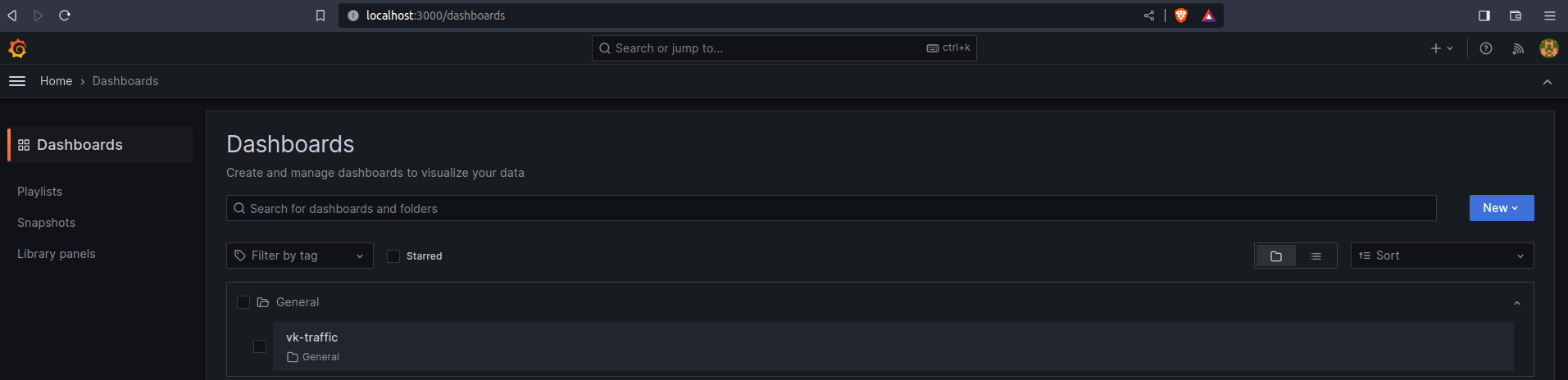
Enter a name in the Dashboard name field and then click Save.
Thank you so much for reading
Follow me on LinkedIn to see interesting posts like this : )


